For students, teachers, scientists, engineers and anyone with a graph worth exploring.
Start with what you have
That graph has more to tell.
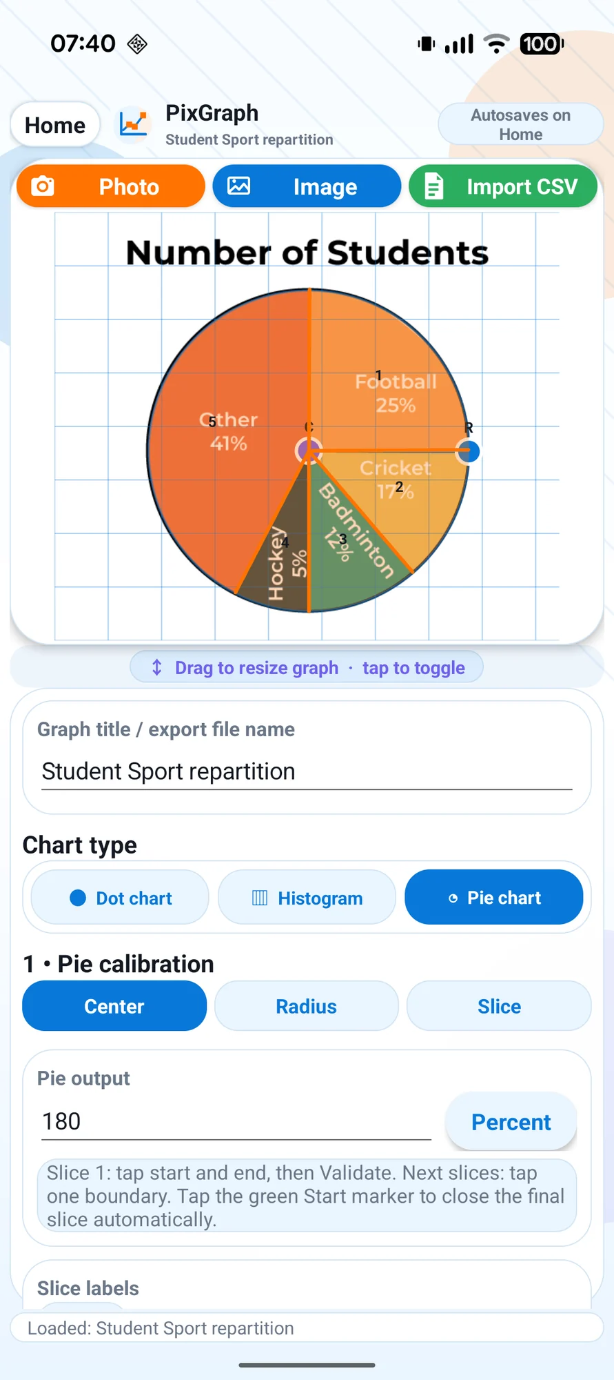
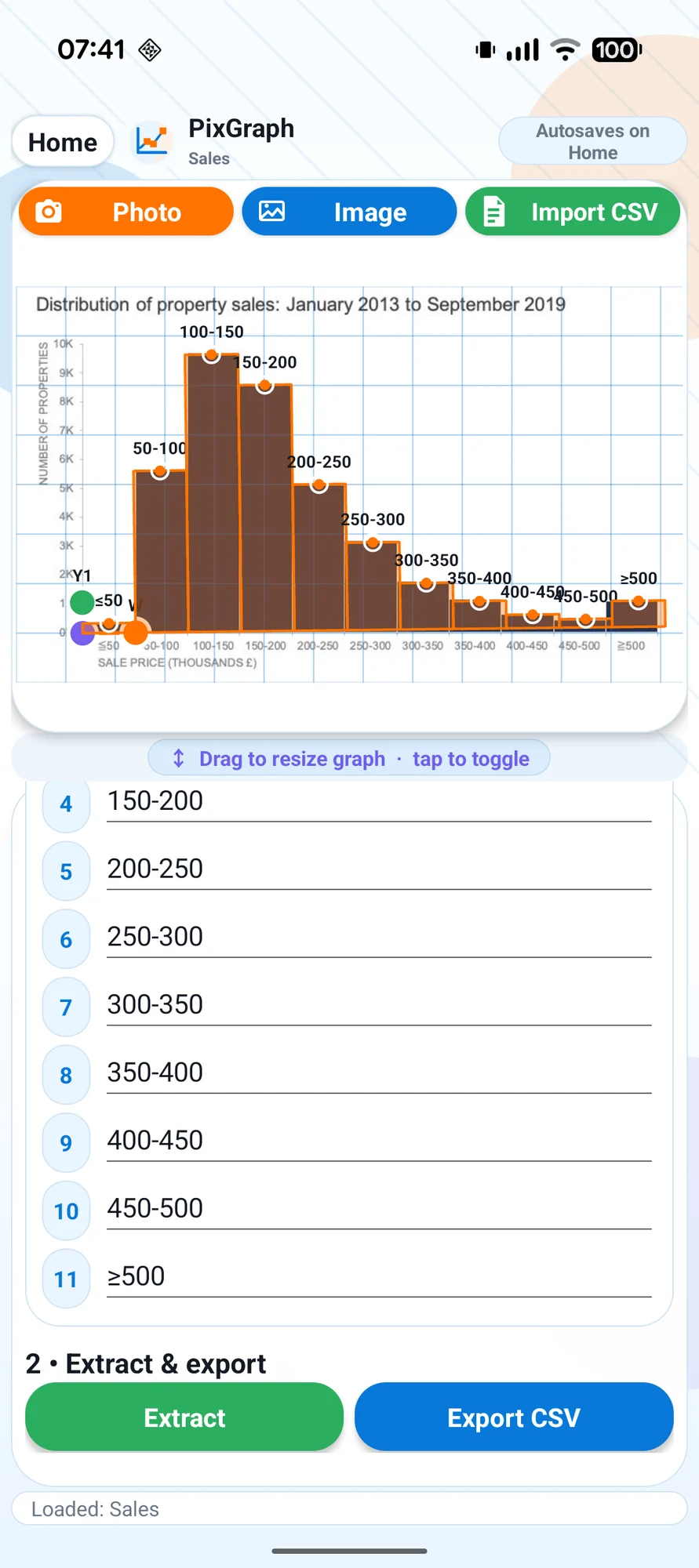
A chart in a paper. A photograph from class. A CSV from an experiment. Bring it into PixGraph and turn it into data you can use. Work with scatter plots, histograms and pie charts without moving to a desktop.
Make each point count
Calibrate. Zoom. Refine.
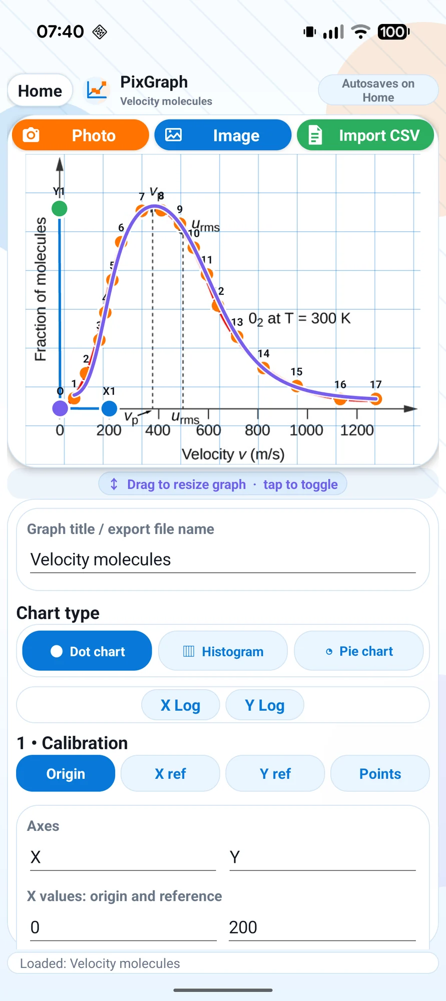
Set up linear or logarithmic axes, zoom into the details and adjust extracted points. Undo and redo make it easy to refine your work. Importing a CSV? Assign columns to X, Y, labels or values to get started.
Go beyond the picture
Find the shape of your data.
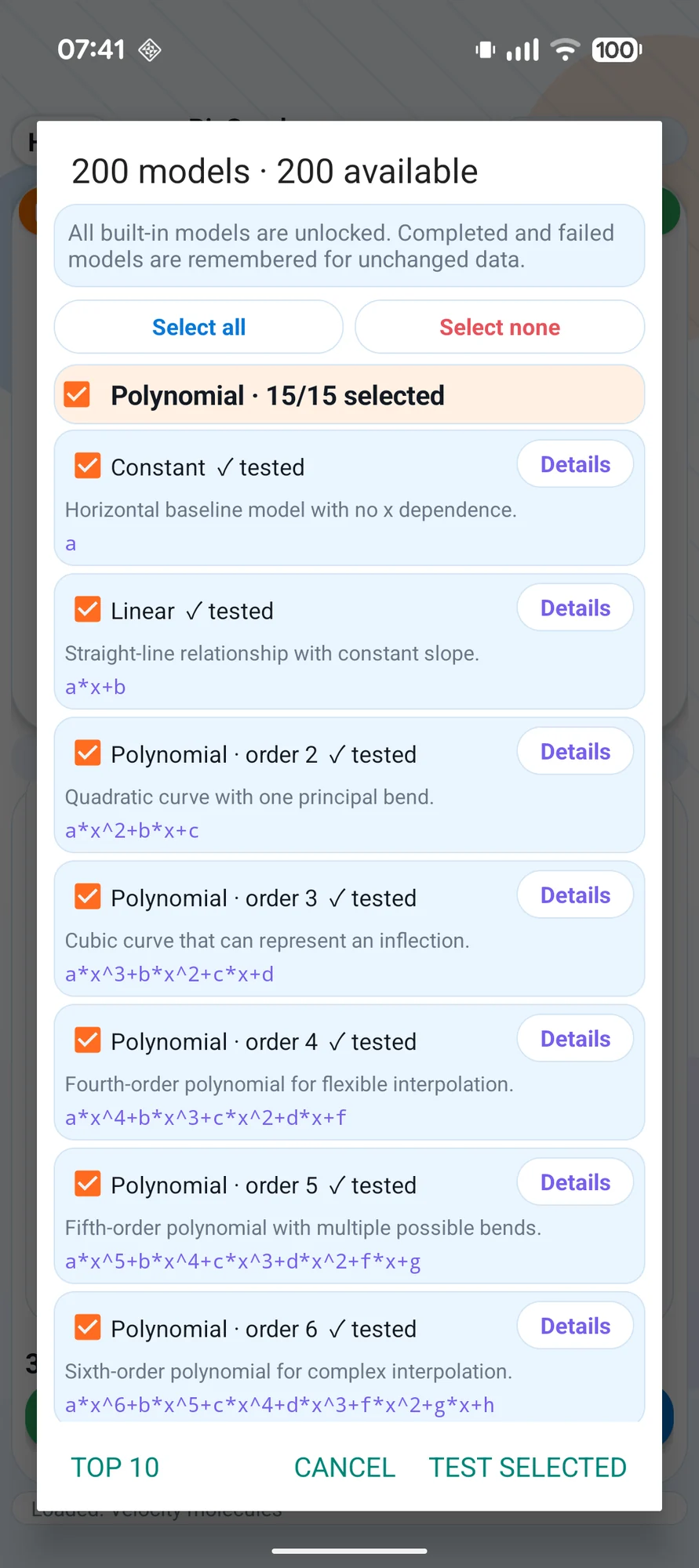
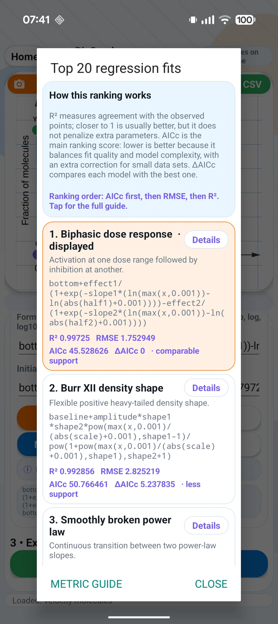
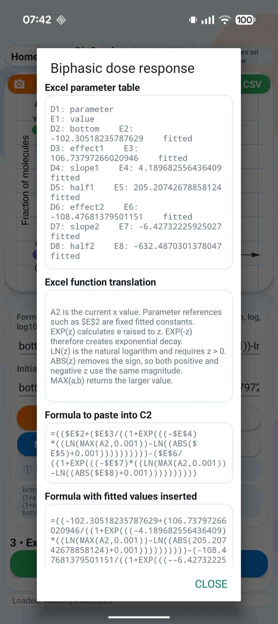
Explore more than 130 mathematical models, from linear and polynomial regression to growth, decay, periodic functions and scientific distributions. Compare fits with R², RMSE and AICc, inspect formulas and parameters, and overlay a fitted curve on your graph.
Take the next step
Keep the work. Use the numbers.
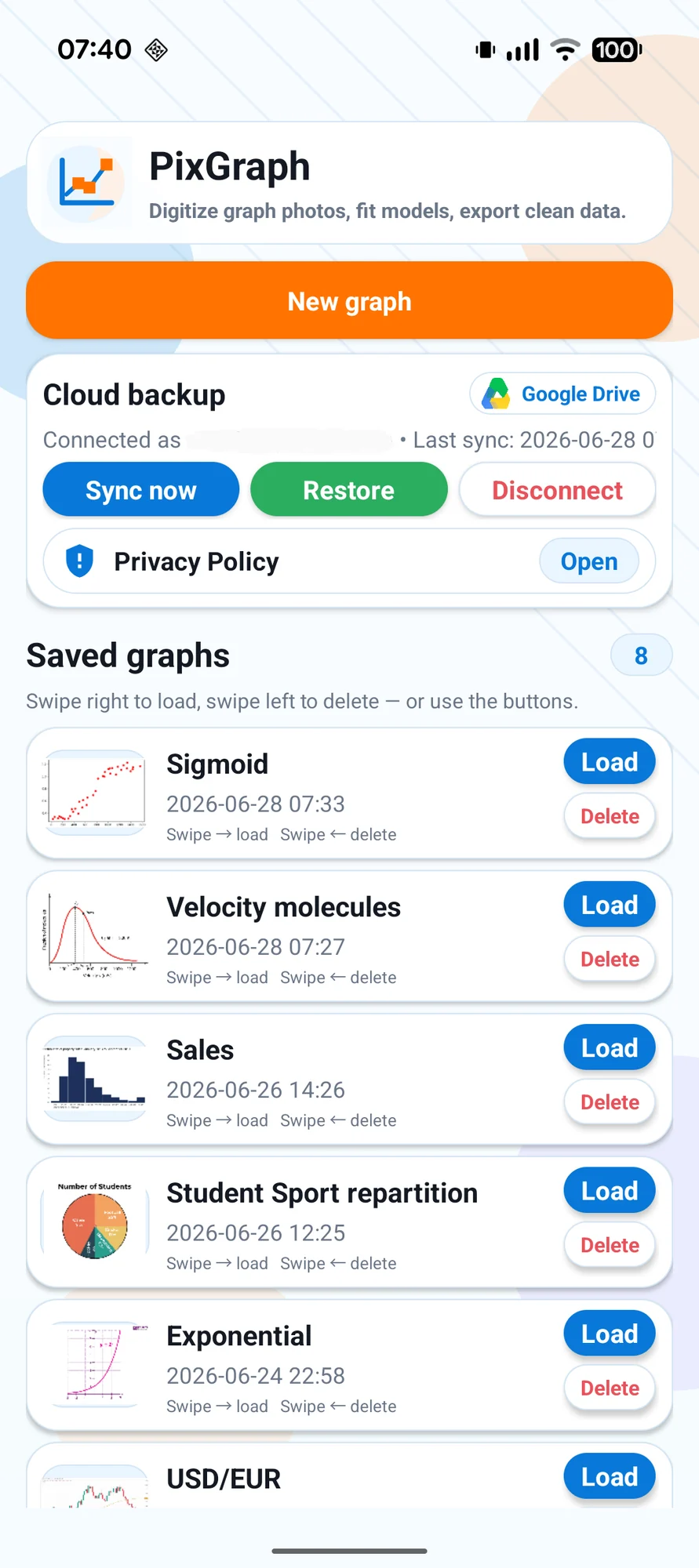
Projects and tested models are saved automatically so you can pick up where you left off. Export extracted data as CSV for your spreadsheet or analysis workflow. Processing stays on your device; Google Drive synchronization is optional.